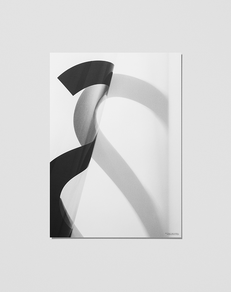
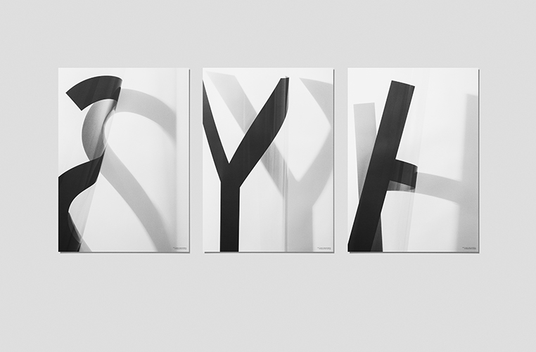
I have many posters from Platype. I never get tired of them, because they are simple and minimal, yet effective to stand out in a room. The new collection called SHY, is a little different, experimenting with expression.
‘This time they went for an all analog interpretation of their typefaces, taking photos of printed transparent paper, playing with light and shadows’
